The piece below is an exercise in cut-out letters. The background is a photo from the Hubble telescope taken off of the Space.com website. It is printed on a sheet measuring 11″ x 17″. The text is lettered on a fine art paper and cut out as one piece. I attached small pieces of black foam core to the back and affixed the lettering to the background. This is a great way to create camera ready art. You can work larger and have it reproduced to postcard size.
Title; Wisdom
Ground: Background is 11 x 17 bond printed with a picture from the Hubble telescope
Lettering on Aches test wove paper
lettering: sumi ink
Size: 11″ x 17″

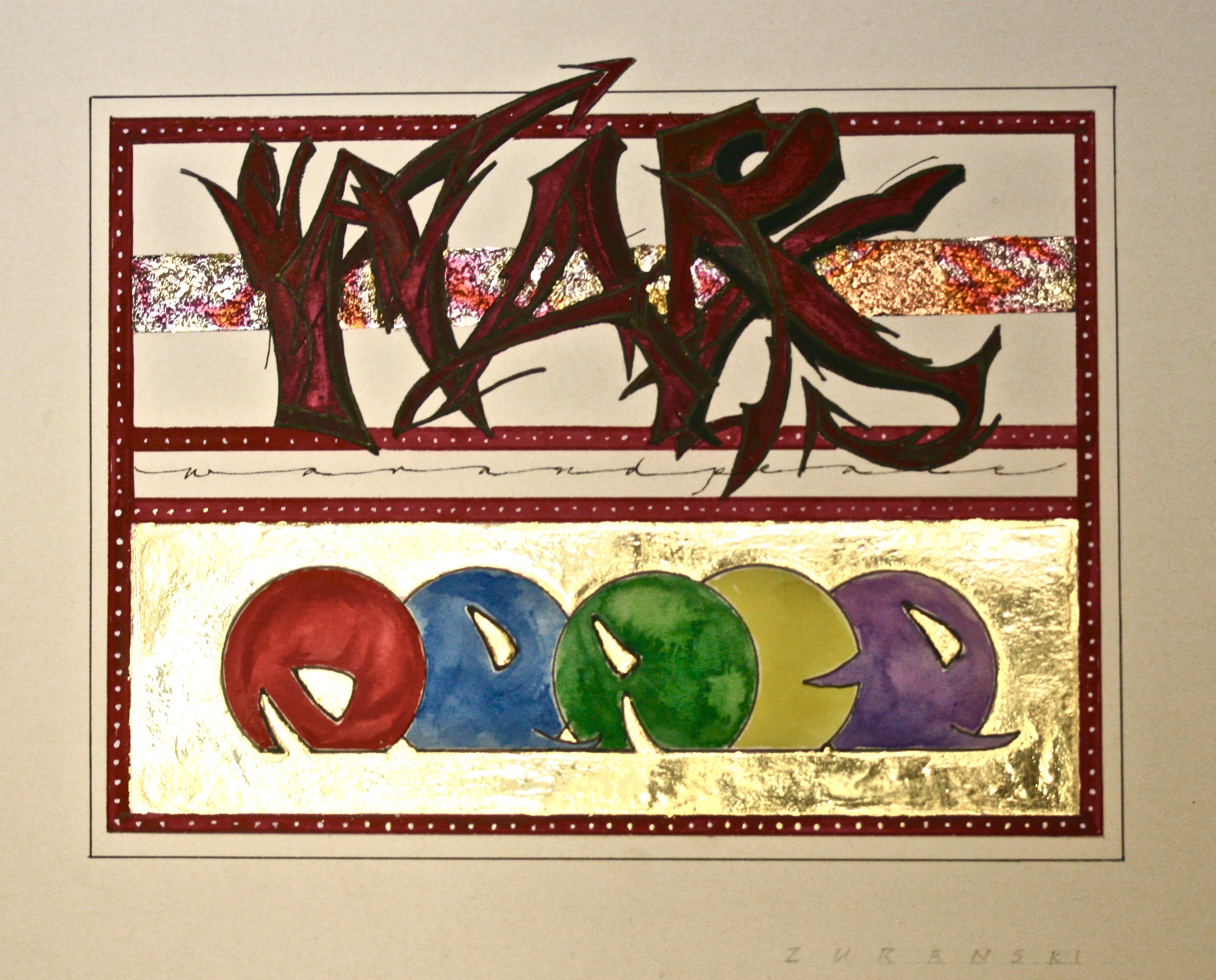
‘War and Peace’ is my first experiment with graffiti based lettering. The word ‘WAR’ is written in a rough, pointed style, in a blood red color. The center bar is guilded in variegated metal leaf and undercoated with a textured mat media. All of this is in contrast to the bottom where the word ‘PEACE’ is written in a rounded form, and surrounded by a smooth application of 23.5k gold leaf. Sadly, gold leaf does not photograph well and you can only see the gold on the bottom-right corner of the photo.
Title; War and Peace
Materials
Paper; Arches text wove
variegated metal leaf; 23.5k gold leaf
Water color
Size; 9″ x 10.5″
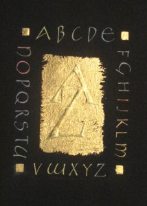
“A to Z” is a simple alphabet piece that was displayed in a juried show at the Newberry Library in Chicago, Illinois.
The gold rectangle in the center was created with a thin layer of gesso which was scraped after it dried. The “A” “Z” was drawn and layered with several layers of gesso. A layer of 23.5K gold leaf was applied over the center and the corner squares. A light brushing created the rough edges around the center rectangle. All of the letters were drawn in white with an ef-66 nib and painted over in the final colors.
Title: A to Z
Materials:
Arches Cover Black
Traditional gesso made with white lead
23.5K gold leaf
gouache
Ef-66 nib; not clipped
size: 7″ x 9″
 The nice thing about calling everything an experiment is that when it blows up in my face I can say I meant to do that and my internal critic goes to sleep and my ego says, yea, whatever.
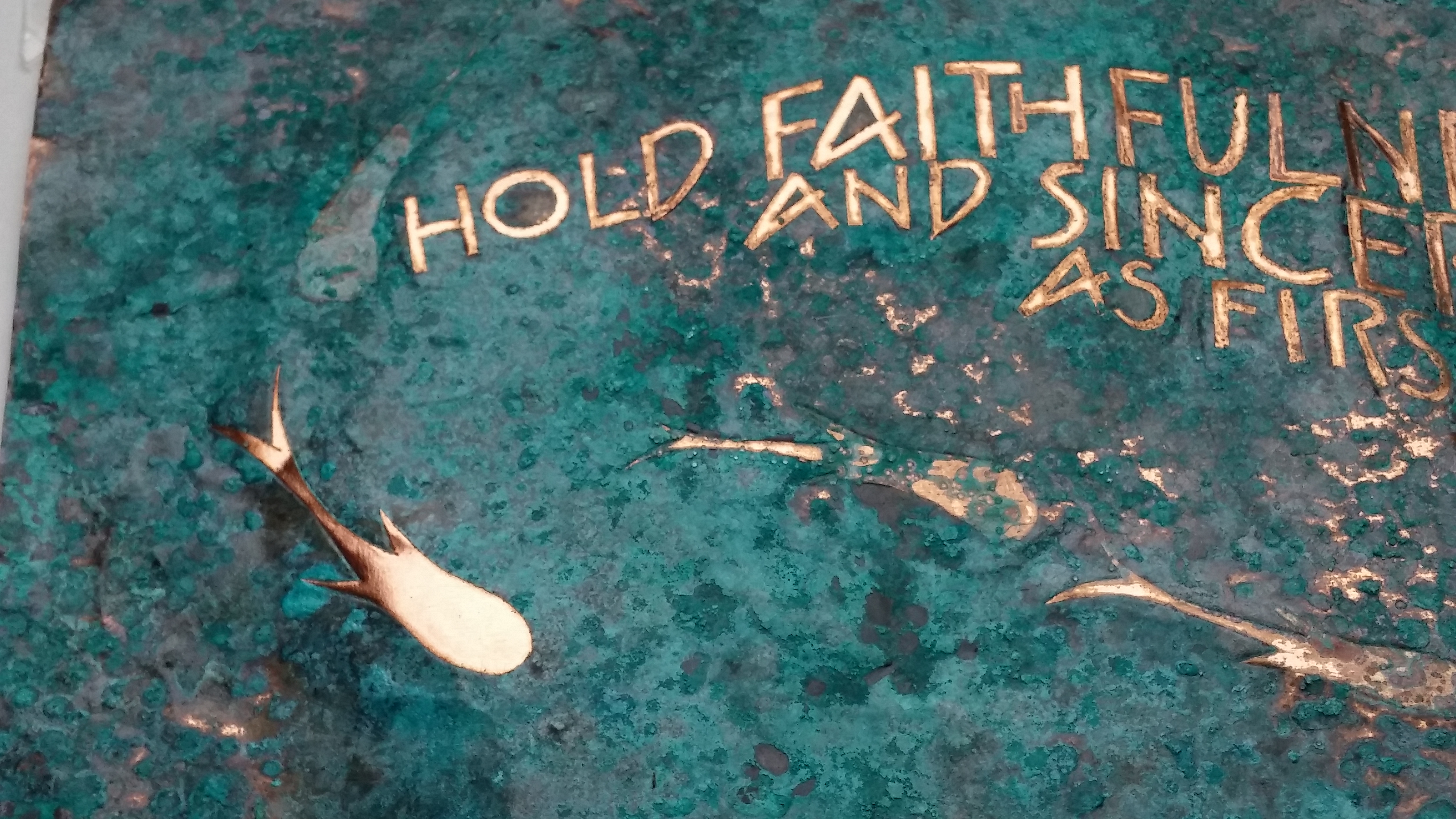
I did this piece in copper with the sole intention being to put a repeating graphic at various ‘depths’ by using timed application of a patina. I chose to suggest fish swimming at various depths in a pond. I chose one patina that was supposed to produce a blue color, and another patina that would give a green hue. Thinking that it was insane to attempt this project with materials that I knew nothing about, I forged ahead with the experiment.
I washed the sheet of copper and covered it with a sheet of contact film. I did the piece on paper and taped it on top of the contact film. I created a negative by cutting away all of the film from the areas that I wanted to patina. All of the text and images were left covered for the first phase of the patina process. I spritzed the copper with water, sprinkled salt over the surface and left the copper in an ammonia vapor bath overnight. I uncovered one fish at a time and put the copper back into the vapor bath for a couple of hours. At the end of this process I took the copper out of the vapor bath and let it dry for a day. Then I selectively sprinkled fresh salt on a couple of areas and spritzed those areas with vinegar and water. This produced a more green patina on top of the blue. After letting all of that dry for another day I removed the salt and exposed the areas on the top layer. Finally I a sprayed workable fixative over the piece to attempt to seal the lettering and one fish so they would not tarnish.
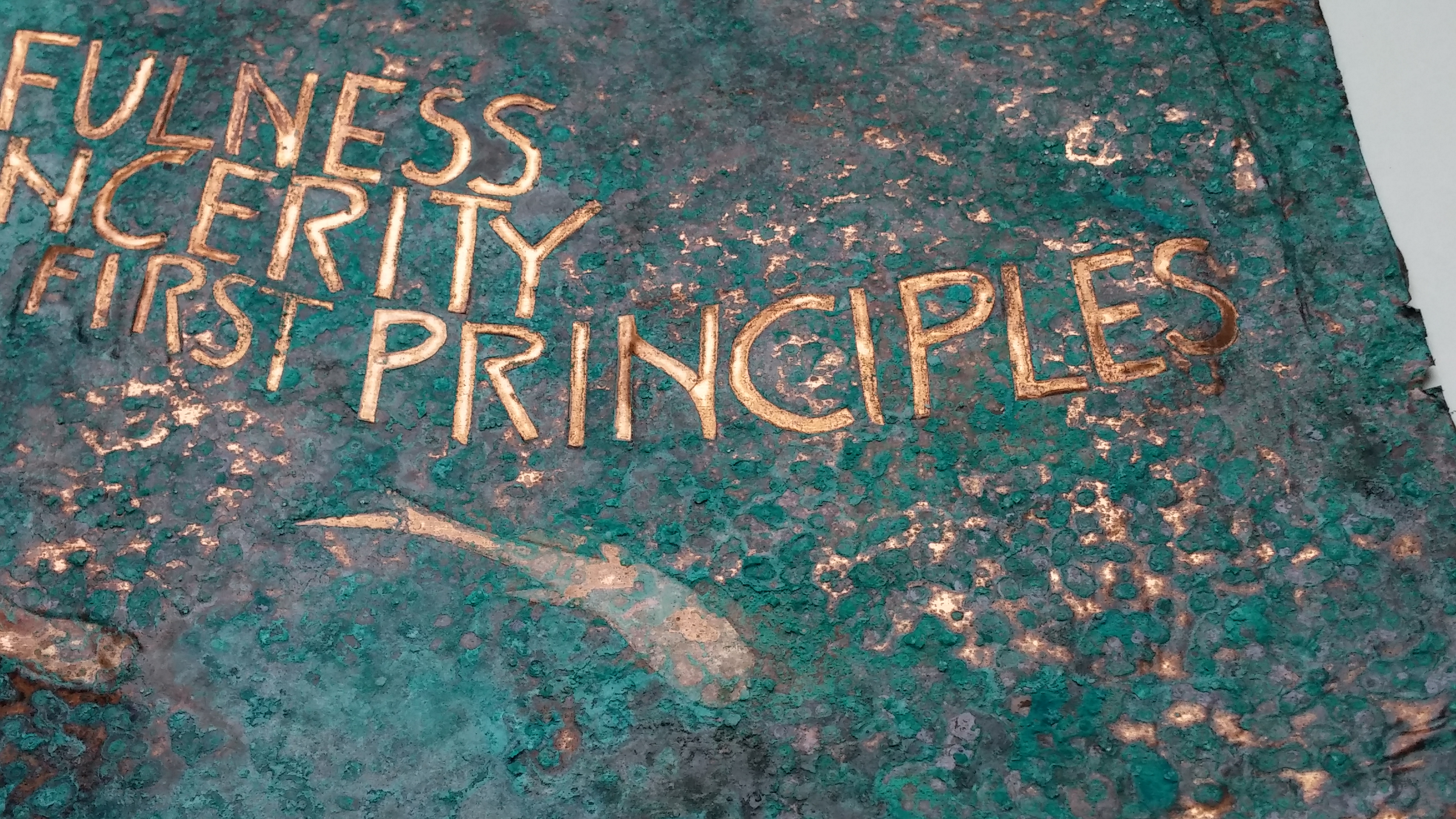
Title: Faithfulness
Size: 12″ x 6″…ish
Materials included B3 nib, black gouache, graphite pencil, contact film, ammonia, vinegar, salt, and copper.
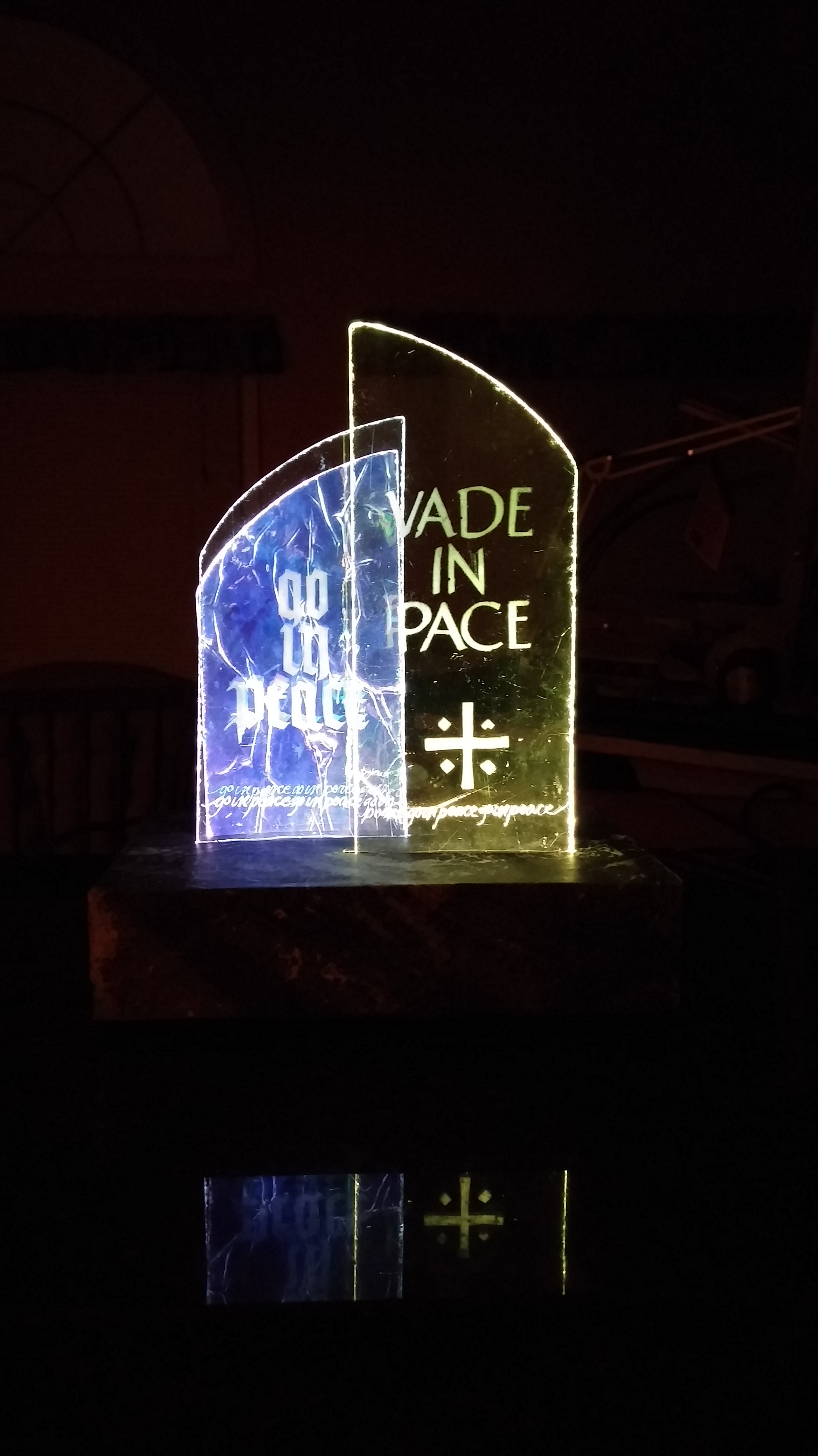
 This is an experimental piece done with two pieces of scrap glass and a scrap of iridescent stained glass. The base is constructed of three pieces; a solid piece of pine-7.5″ x 5.5″ x .5″; a second piece of pine that is hollowed out and a piece of balsa wood on the top. The base is covered on sink-art Tyvek.
Calligraphically, the Latin text is ‘pushed forward’ by being a larger single pane, having a graphic and being highlighted in yellow light. The English translation is ‘pushed to the back’ by being smaller, being a double pane, and cast in a violet light. In addition, the iridescent stained glass is also lighted in violet light. “Go in peace” is written across the bottom of the two pieces of scrap glass as a unifying element. The unifying line is engraved and the main text is etched into the glass.
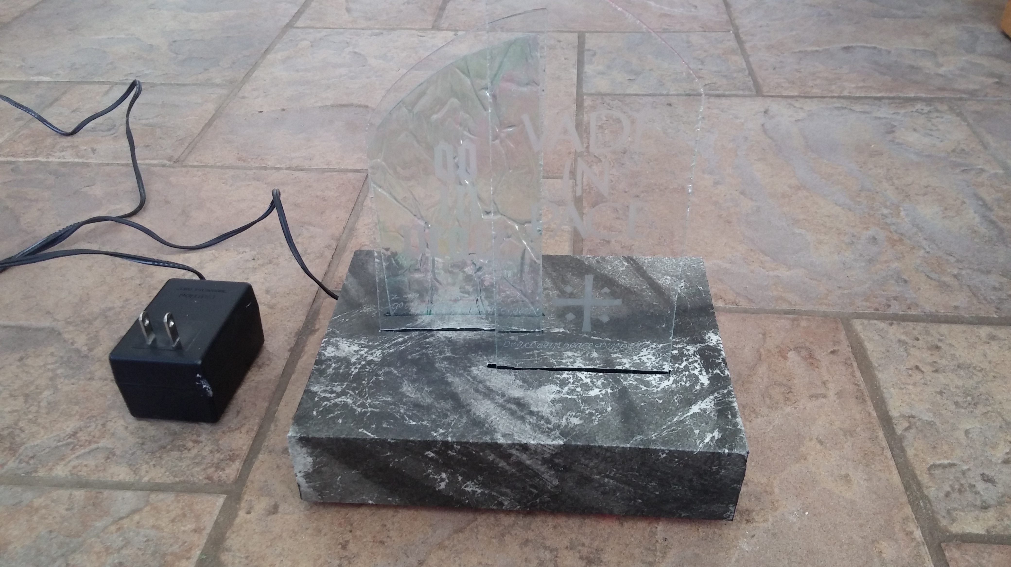
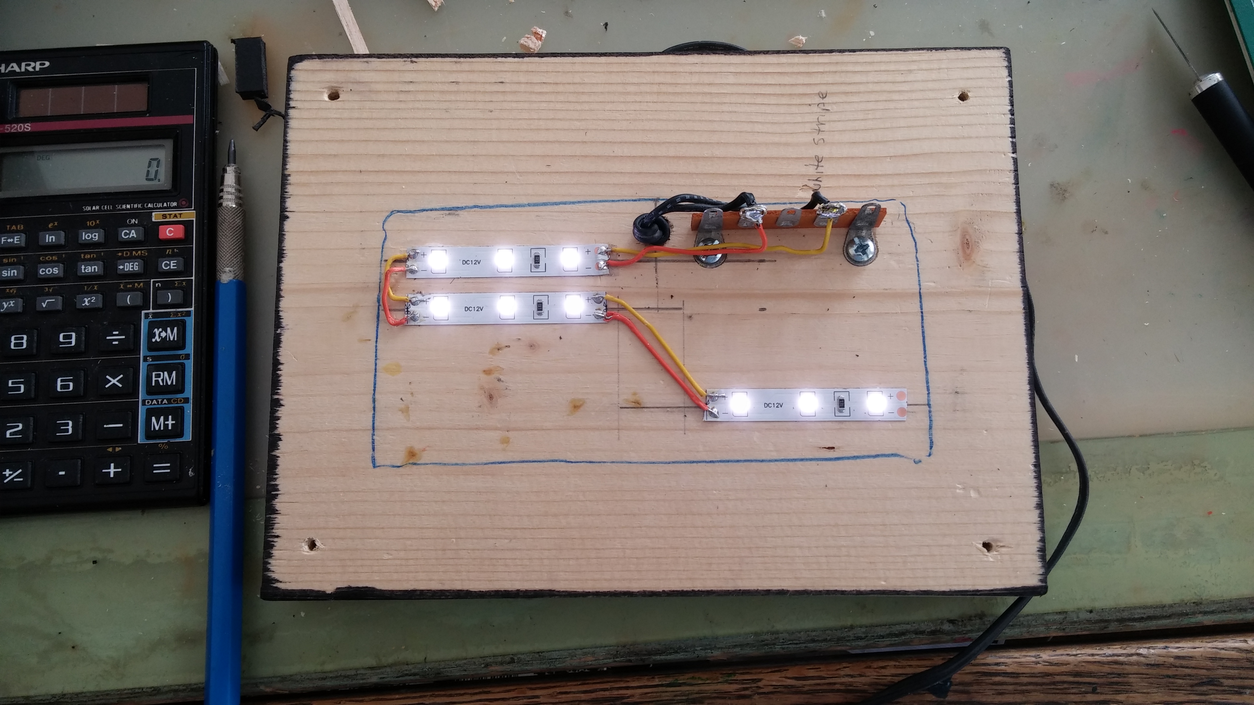 I have had this challenge for quite some time now; how to effectively light a piece of calligraphy executed in glass. I have used miniature fluorescent bulbs, but the aesthetic problem is getting uniform lighting across the entire piece of glass. Pictured here is the bottom piece of pine with the Light Emitting Diode (LED) circuit that I designed to light the glass. The LEDs are all super bright white. The type of colored mylar used to wrap Easter baskets is perfect as a light filter, and that’s what the yellow filter is. The violet filter is a scrap of violet tissue paper (believe it or not). Although not shown in the picture, the filters are glued to the top of the LED strips. The LEDs come in strips of 300, and are dividable into strips of three. This means that an LED light strip could be designed to completely surround a piece of glass cut into a ‘regular’ shape.
I have been exploring a technique I call overwriting. This technique plays on the results of overwriting one letter over another. The overlap can be loose enough to allow the word to be read, or it can be so tight that the word becomes a texture; unable to be read at all. In the case of this piece, the word is ‘God’, and if you trace over the path of the marks you can discern the individual letters. The negative spaces are painted to mimic stained glass. The challenge with this technique is to develop the freedom of movement so you can create fluid marks. I have also used hand made brushes and house painting brushes. More on that later.
Title: God
Materials:
Text wove paper
Gouache
Walnut ink
Twinkling H2O paints
23.5 K gold leaf
Instacol mordant
Folded brass pen
size: 8″ x 10″…ish
 The word is ‘life’ but you have to work for it a little. The text was written with an ef-66 nib. As of this writing I do not have a close up of the text area. I need a better camera before I can get in closer.
‘Life’ and ‘God’ share the same material list.
Title: Life
Size: 8″ x 10″
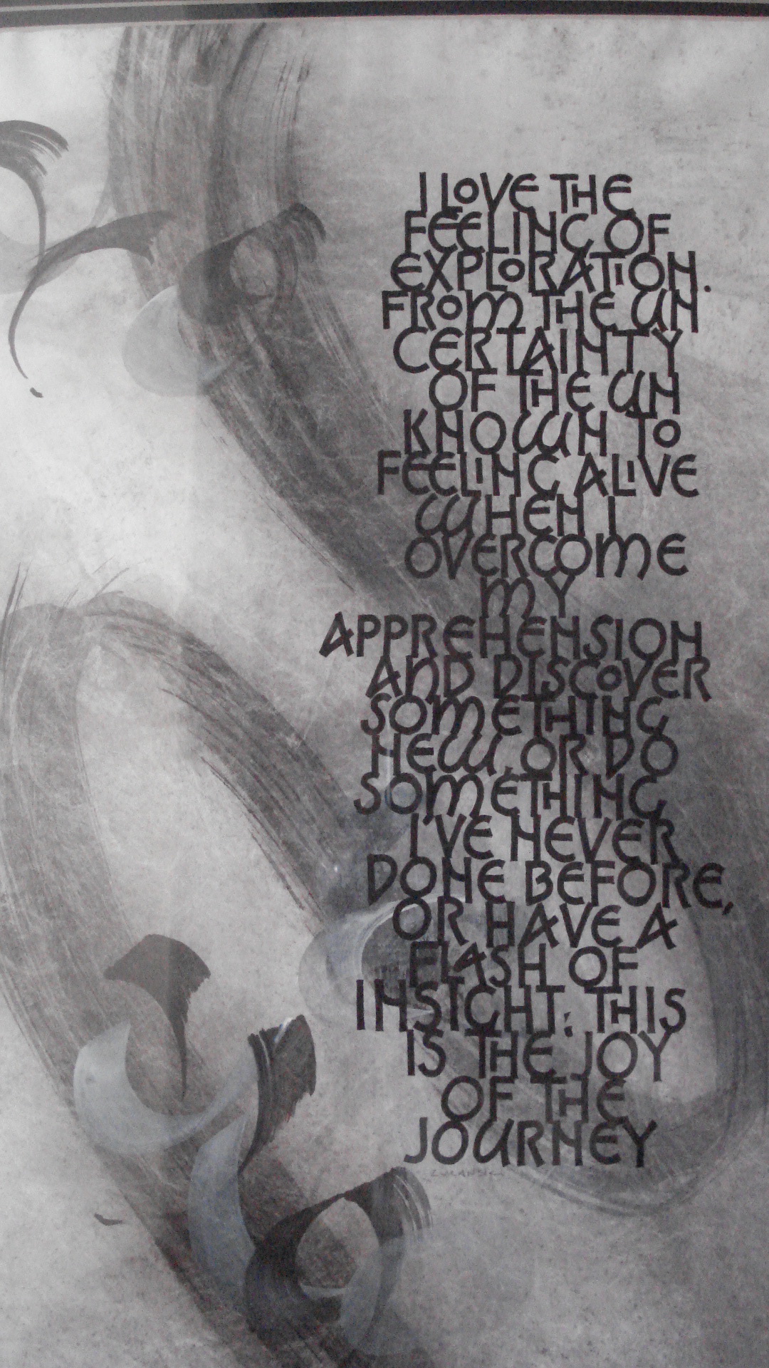 This piece is about the joy of exploring. These are my own words and express, in my own awkward way, how exhilarating it is to create something new. It is an experimental piece combining a classical letter variation with a purely abstract mark and an abstract lettering style in three distinct layers. The first layer is an abstract mark intended to portray a path, and was laid down in sumi ink with a 1.5″ house painting brush. The second layer is an abstract letter form. It says, ‘the joy in the journey.’ The top layer is intended to be completely legible, contrasting with the illegible abstract letter form. The symbolism is that while you may have a journey planned, the path is not always so clear or predictable. Originally designed as a black and white piece, I have experimented with painting the counters of the word ‘exploration’, and using gold in the counter of the word ‘joy’. The jury is still out on that one. It currently hangs in my home where it can torment me until I make a decision. It’s only been two years. I expect clarity any year now.
Title: Exploration
Materials:
Tyvek
Sumi ink
House painting brush
Speedball B3 nib
ef-66 nib
Hand-made Balsa wood ‘brush’
Size: 12″ x 18″
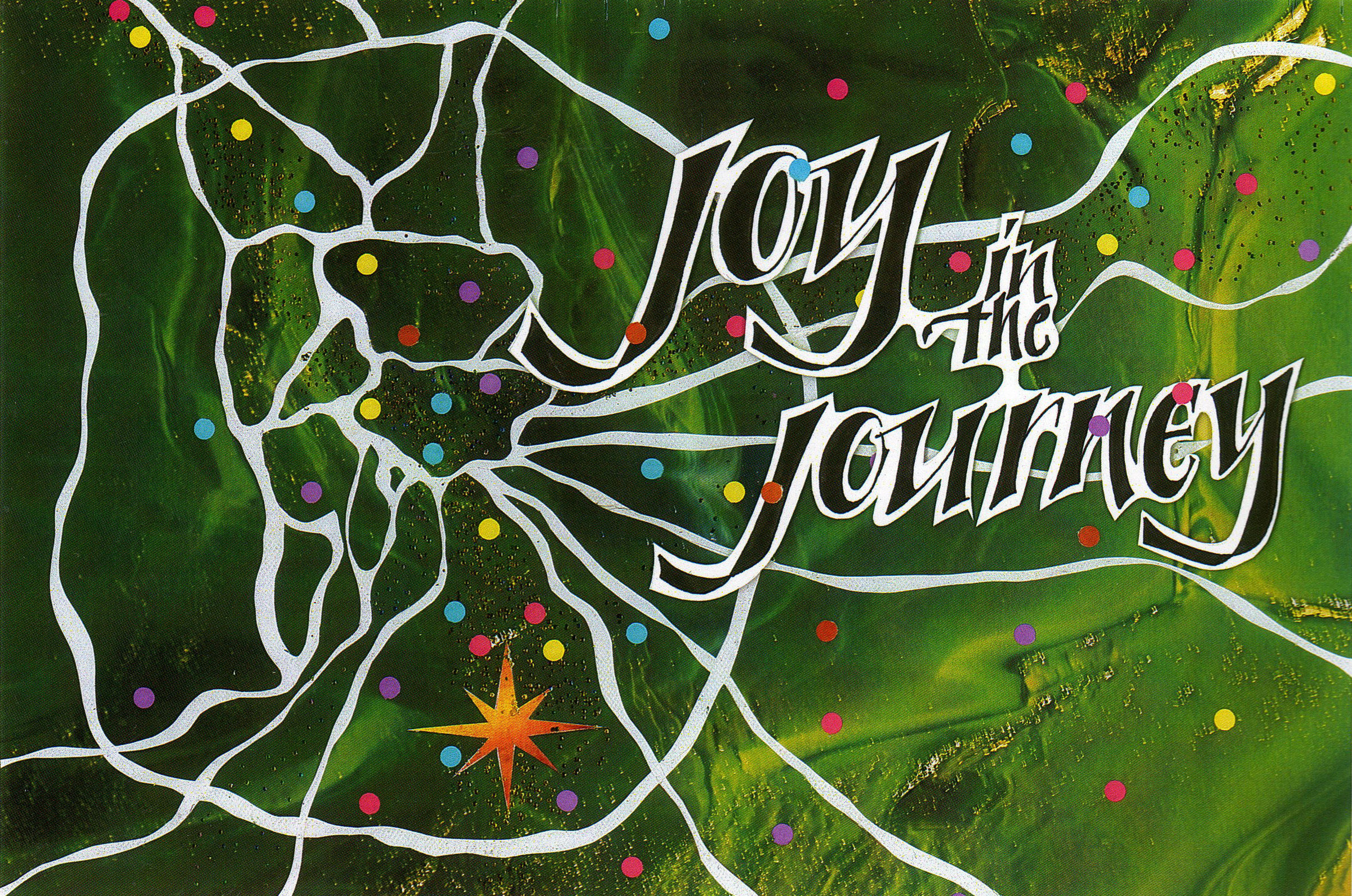 Joy in the Journey–the colorized version–is an experimental piece that was created as a piece for reproduction. I created a post card with it. The letters were hand drawn, painted in and cut out. All of the words are connected together; you can see the joins next to the ‘y’ in “joy” and under the ‘h’ in “the”. The back ground is a photo copy of a sheet of stained glass. The white pathways are the cut lines where the back ground was cut up. The pathways represent the streets of Rome, Italy, and the dots are points of interest.
Working large, and for reproduction, allows a freedom all its own. I made sketches of the design and adjusted it before committing to a final layout. I covered a sheet of paper with wax, providing a low-tack surface that the cut paper could be attached to. This way it is easy to re-position elements in the design. The lettering is a separate piece that can be positioned anyway I like. The finished piece can then be scanned and processed as necessary.
Title: Joy in the Journey
Materials:
Gouache
Photo copy of stained glass
Cut paper
Size: 11″ x 17″
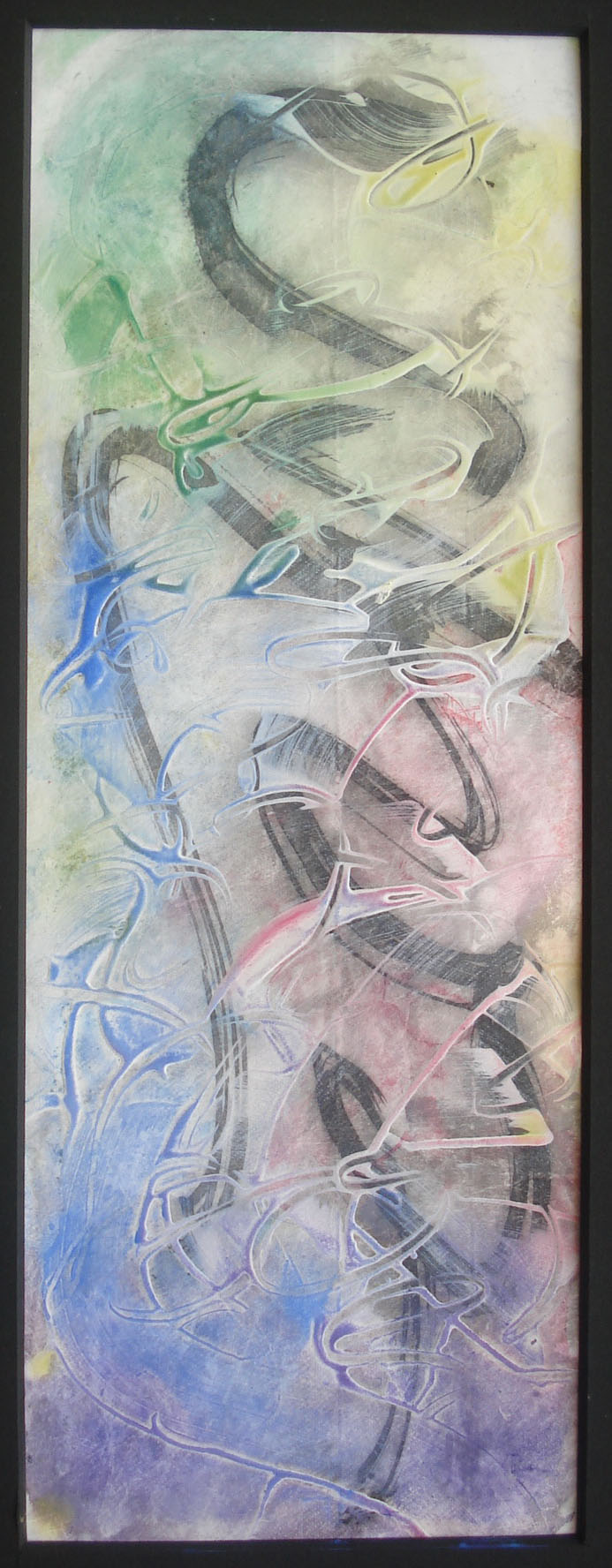 Perhaps the Western view of what constitutes a calligraphic mark is, ultimately, quite restrictive. A quick study of Chinese or Arabic calligraphy reveals marks that are beyond the narrow Western viewpoint. What, then, defines a calligraphic mark? If a calligraphic mark can be defined by its movement and life, then any letter can be dissected into individual marks with their own movement and life. Here is an example of a calligraphic piece that is pure abstraction. It includes marks have movement and life in various free-flowing weights, colors and layers.
This piece is experimental, using sumi ink applied with a hand-made brush on the bottom layer. Various areas were then colored with soft pastels. The top layer is acrylic gesso moved about with a credit card and a brush handle. The layer was colored over with soft pastels, playing on the gesso lines for emphasis. As an experiment, the piece was created as a throw-away, with the point being to see what happens when gesso is applied over another layer. It succeeded enough that I framed it for my own enjoyment. It hangs in my studio as a reminder to not take myself too seriously; to have fun with the process of creation.
Title: Happy Dance
Materials:
Tyvek
Sumi Ink
Soft Pastels
Hand-made brushes
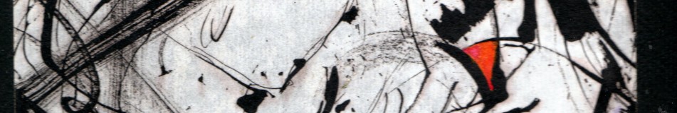
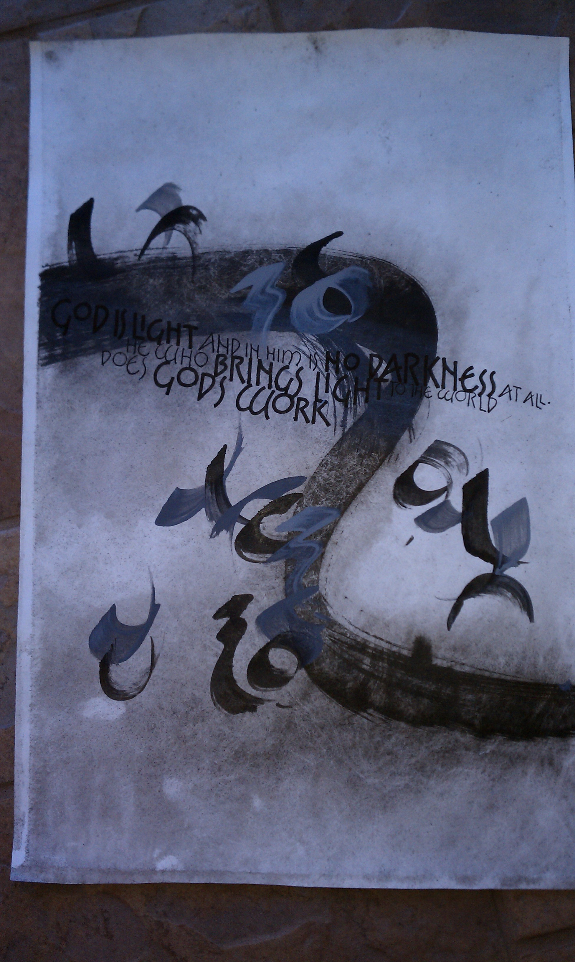
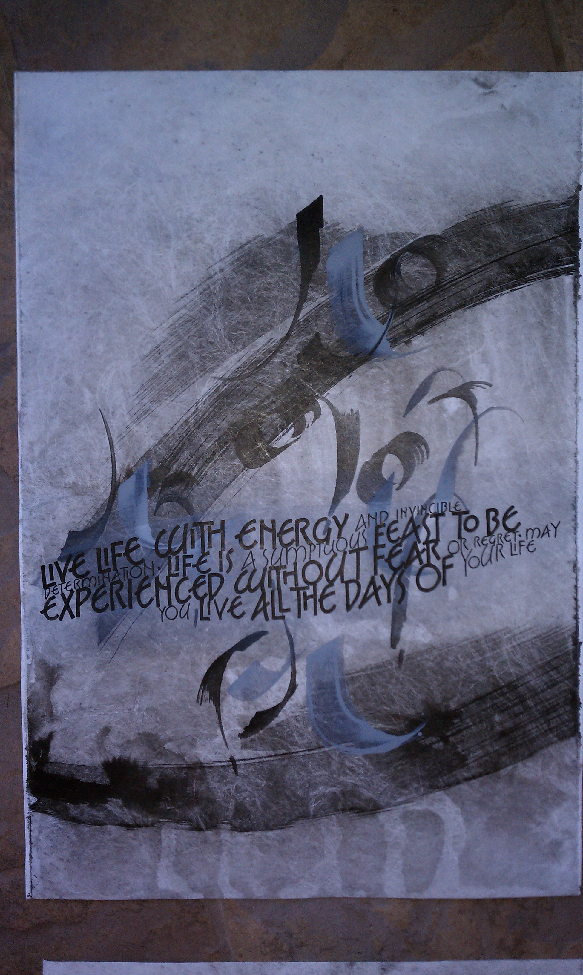
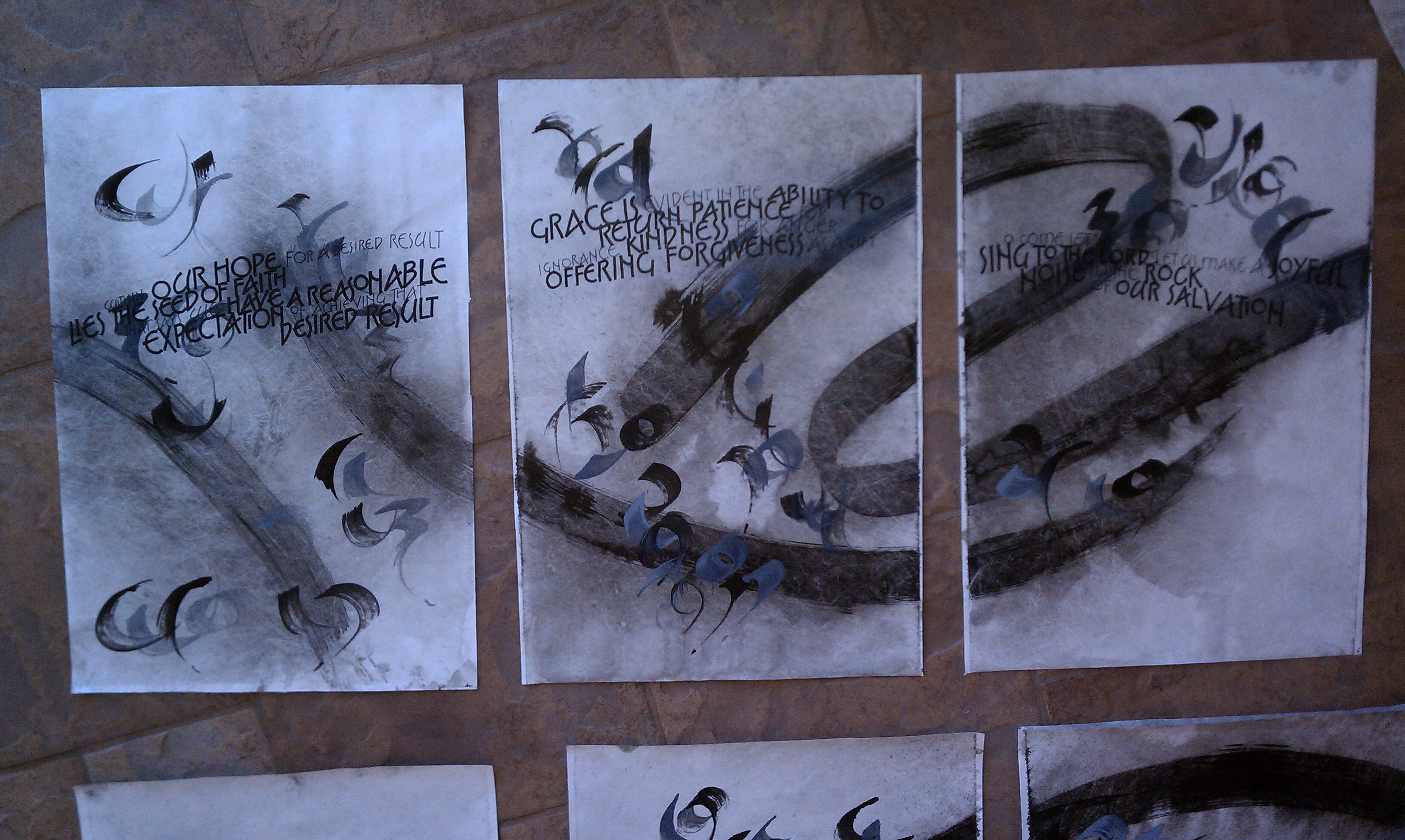 The design concept of mixing abstract forms with legible text has led me to an exploration that now has lasted several years, with no end in sight. In my beanie brain, the abstract marks must have meaning. This next set of images demonstrates a project created on nine 13″ x 19″ panels of Tyvek. All nine panels were taped together and the largest set of abstract marks were applied with sumi ink. These marks were created as ‘sink art’, where the ink is allowed to set up briefly, then the marks are washed and allowed to run. This creates random washes all over the sheet.
The abstract marks are a legitimate, rounded form of an alphabet. The largest marks spell the word ‘faith’ which spans the entire nine panels. Set one next to the other the movement of the marks is apparent. My intention was to create a large piece in small sections that flowed, one panel into another. In addition, I wanted each panel to be able to stand strong as an individual piece. The smaller marks, from the same alphabet, are short texts written on the theme of the sheet. Each sheet has a theme ranging from ‘love’, ‘faith’, ‘hope’ and so on.
These texts are decipherable if the reader understands the key to the alphabet. The intention here is to illustrate that the concepts of faith, while right in front of us, are sometimes beyond our reach.
The legible text flows on a line that is contiguous from one sheet to another, while also standing strong on its own. I wrote most of the text myself to fit the theme of the sheet. While the text undulates in size and weight, the vertical lines of the letters are vertical to the sheet, they do not follow the tangent of the baseline. This vertical stability prevents the text lines from having a sing-song look.
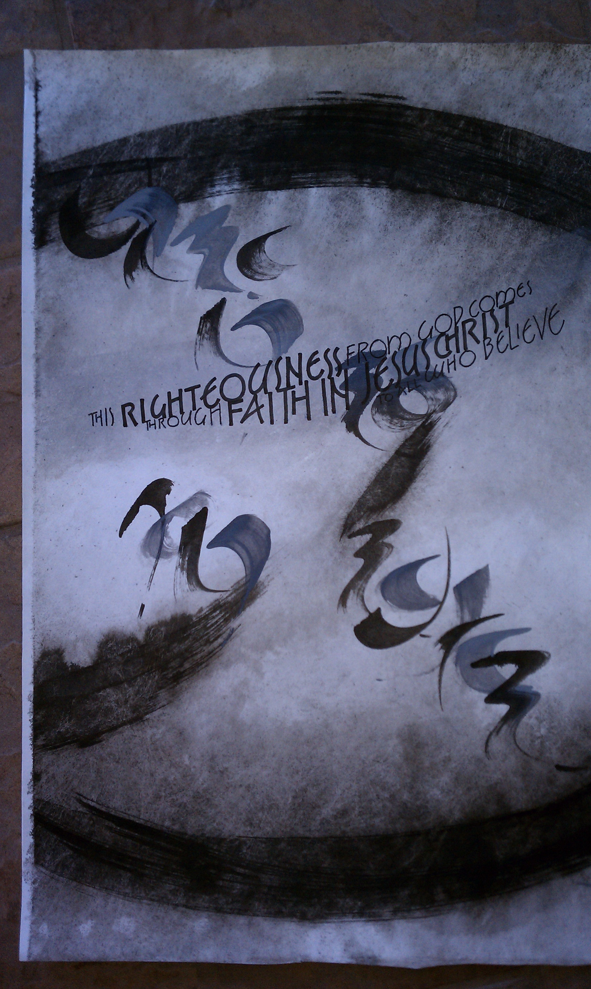
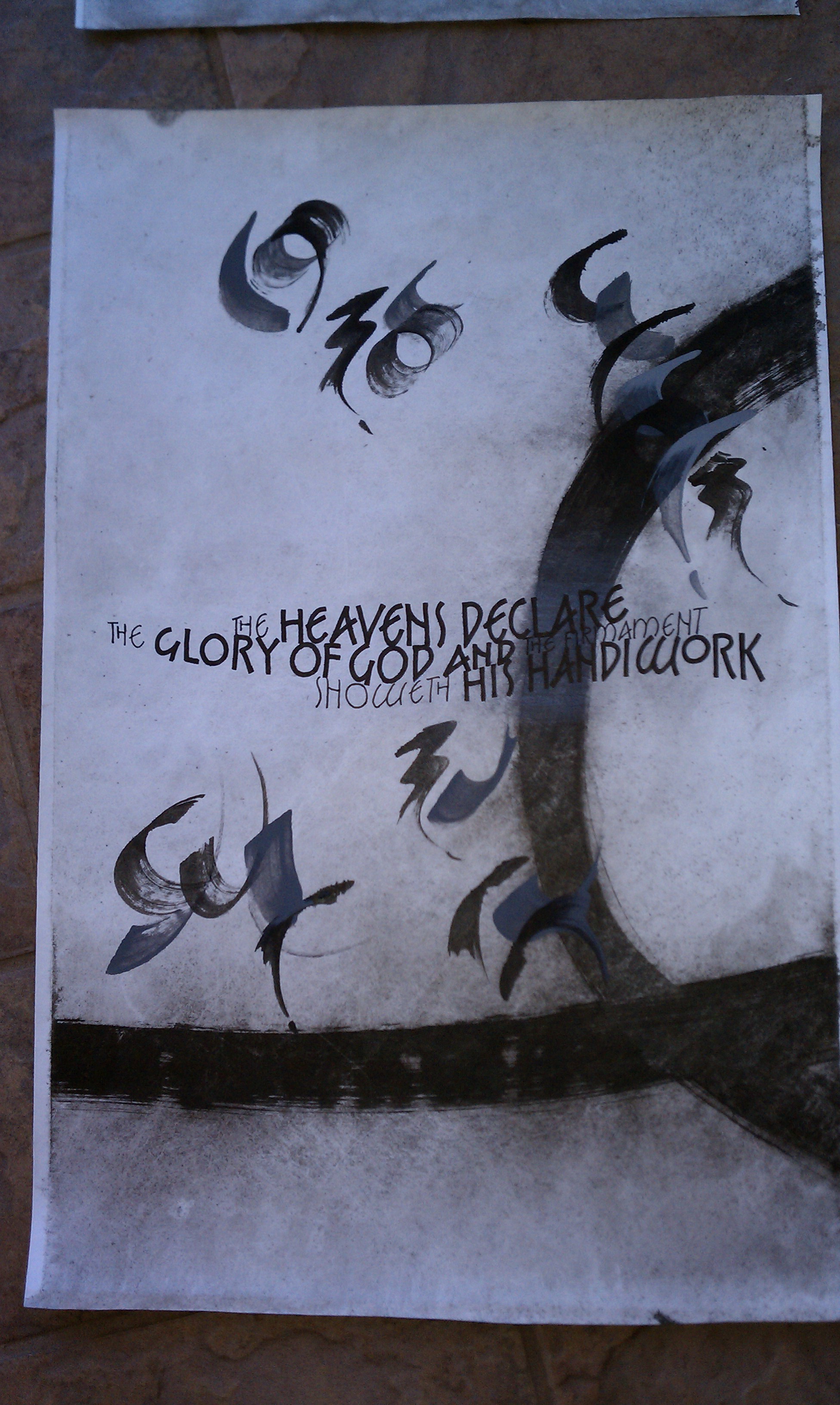
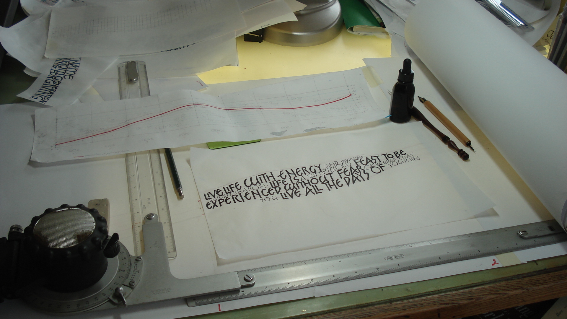
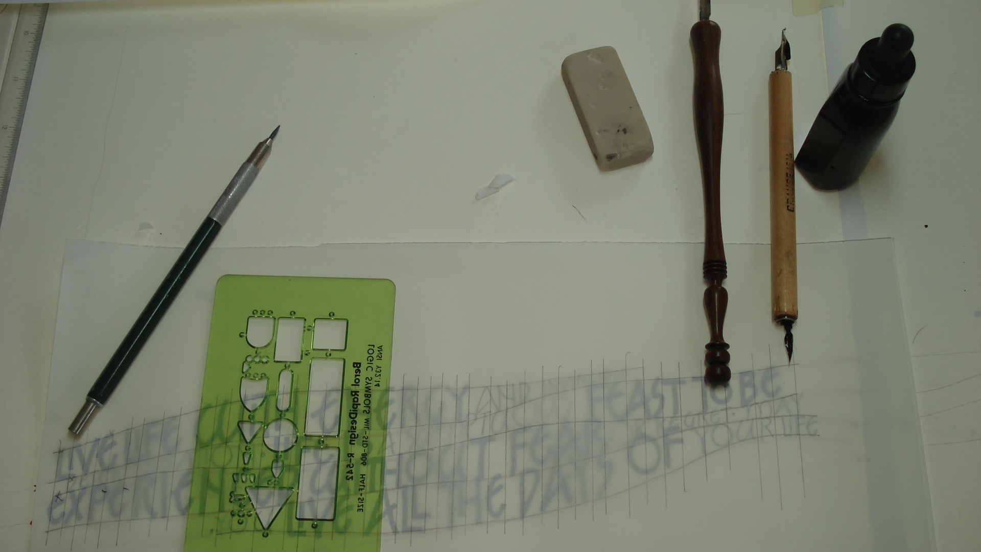
These are closeups of some of the pages, including images of the text layout design in progress. From this relatively simple concepts in three layers I moved onto a set of works using this design concept expanded to as many as seven layers.
